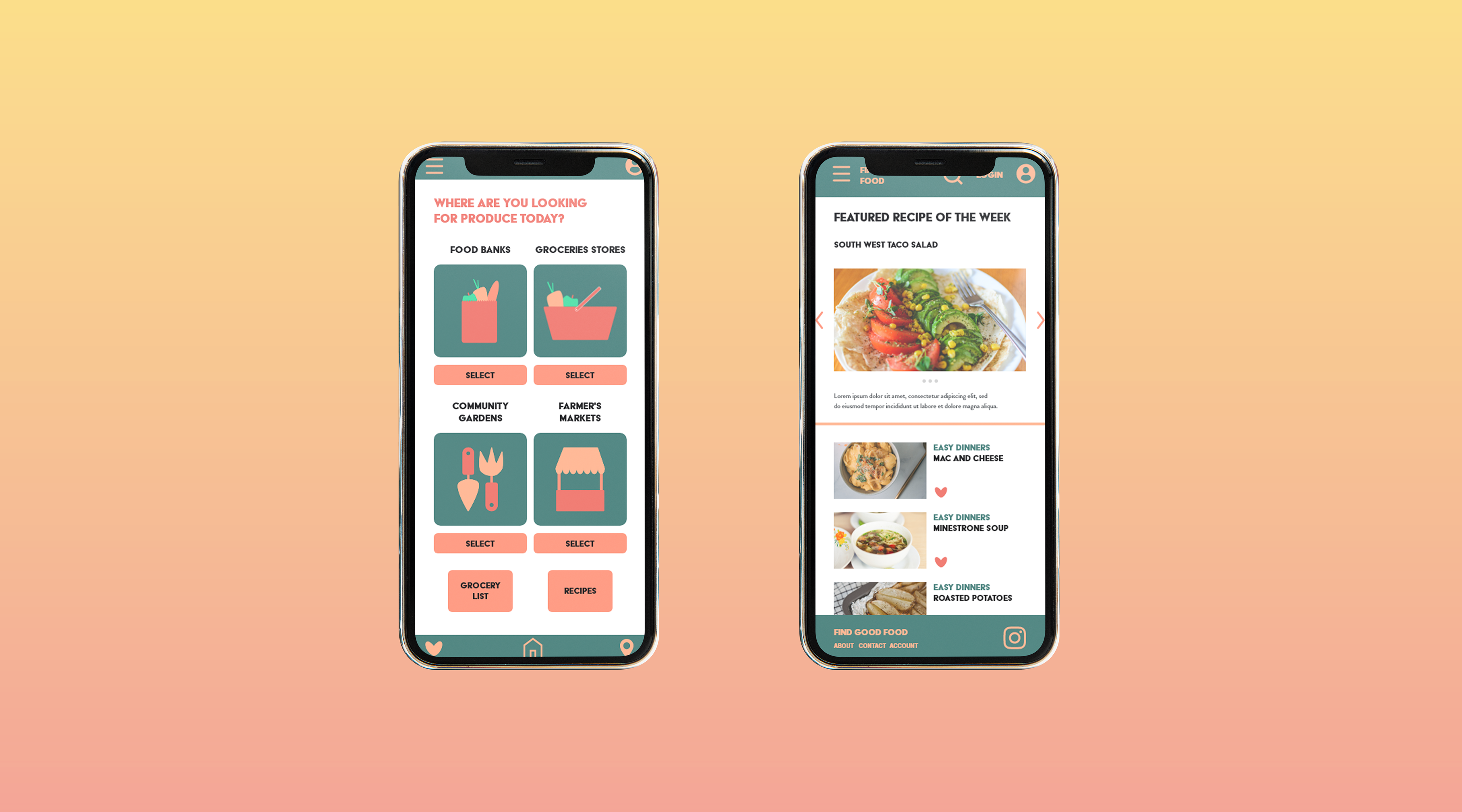
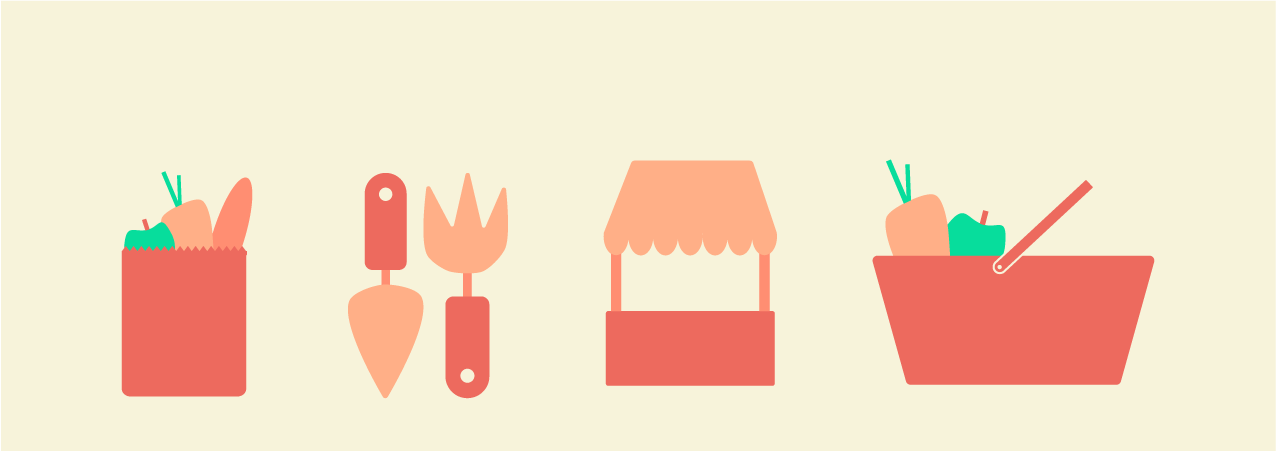
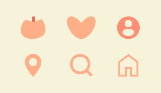
Find good food was a concept app that helps users find nearby grocery stores while simultaneously suggesting recipes based on ingredients that they already have. Here's how the icons and assets came a long
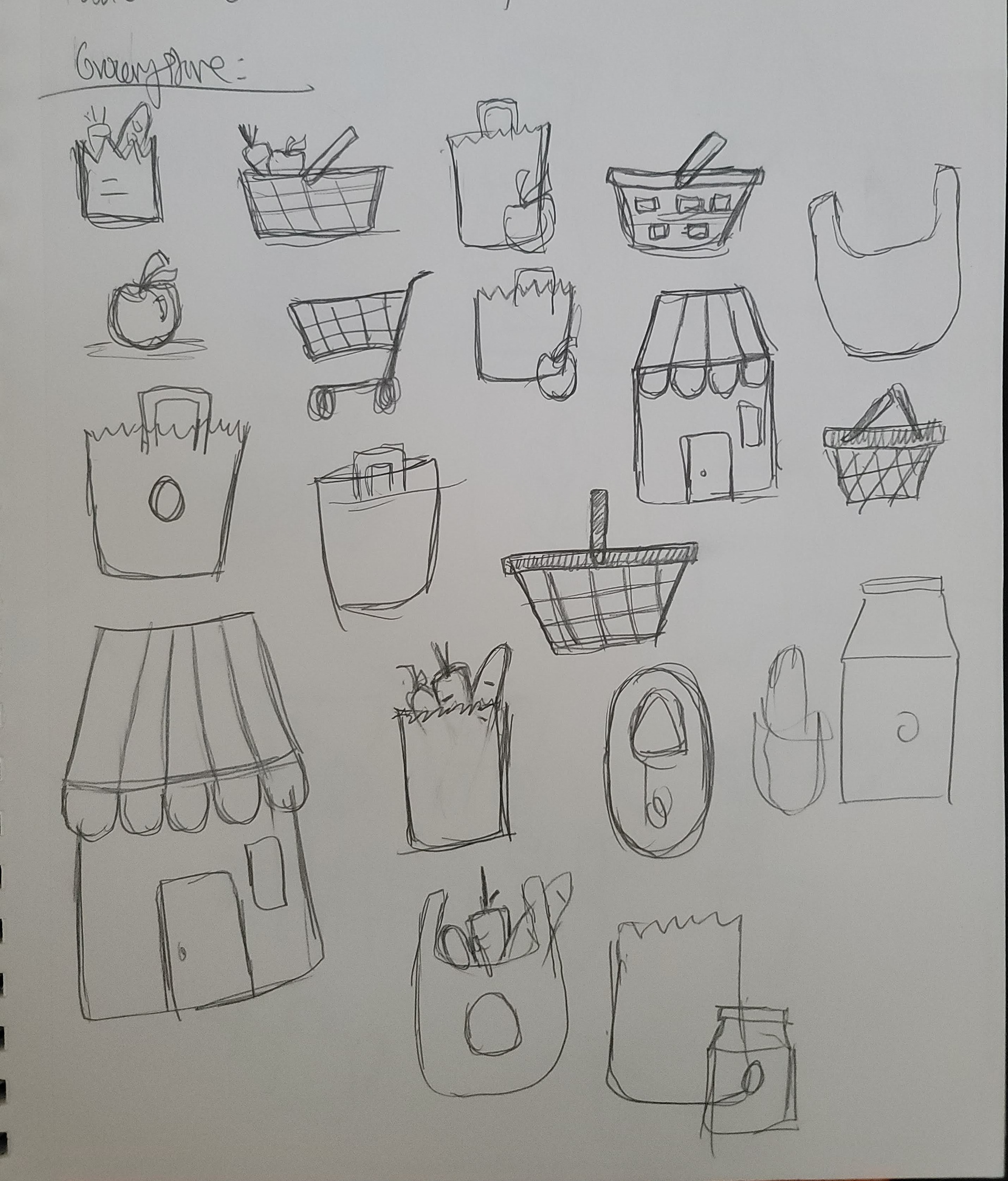
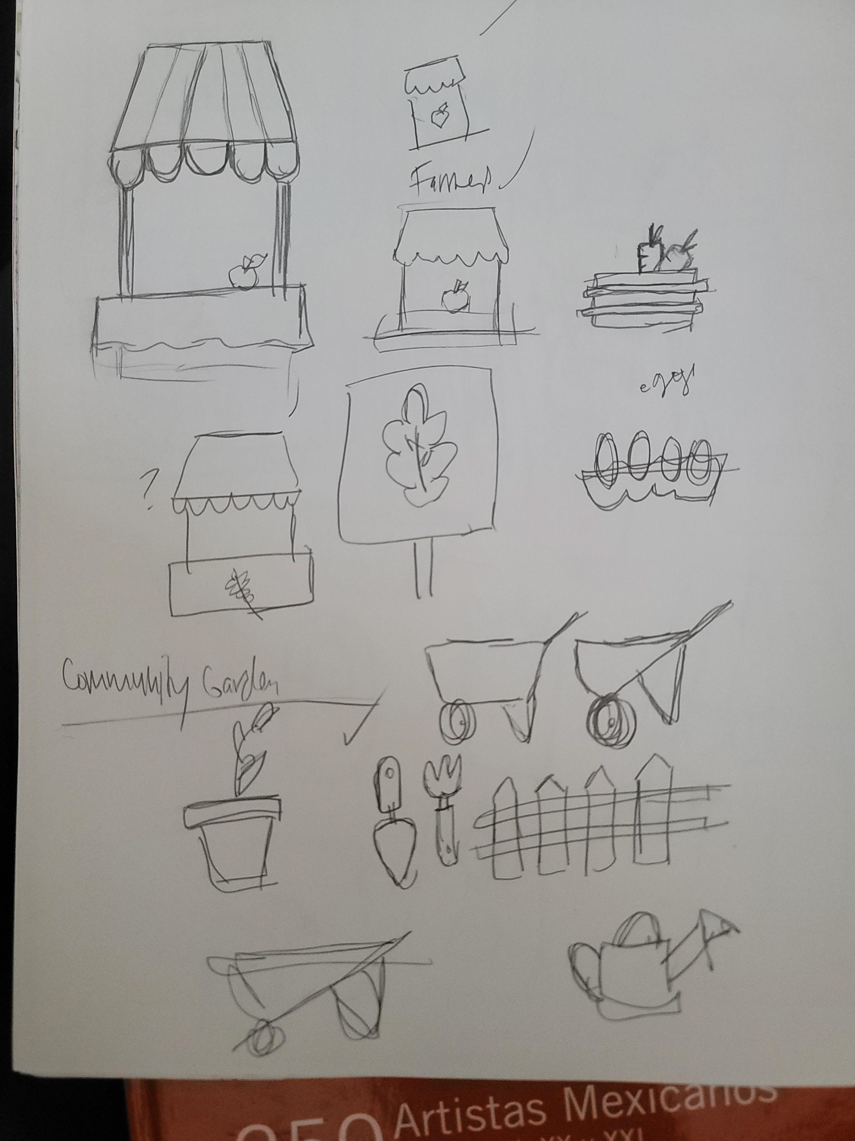
The Idea was to create a simple app that felt approachable and easy for the user to use. After many sketches I settled on a flat icon style. In order to create a cohesive and friendly visual system, I went with warm tones that felt cozy but bright for the color PALETTE. An Icon style that is familiar to the average user. With symbols that are easily RECOGNIZABLE as well. Here are the end results. Ta Da!
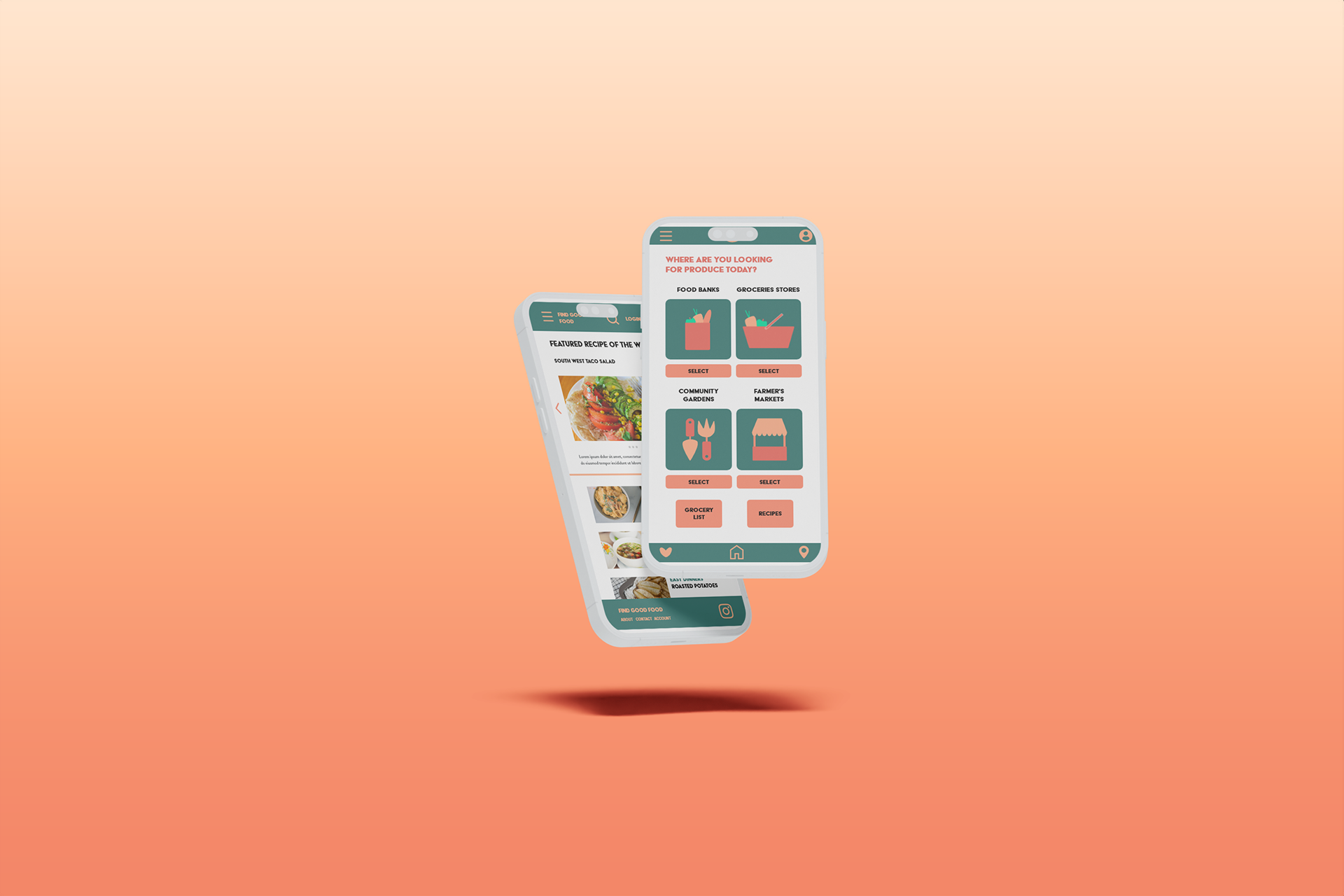
Below is a comparison between the downloadable app and the mobile website. This is part of a larger project that was originally developed while I was getting a UX/UI Certification from google via coursera. I had more fun making the visual system so that's what I'm showing you.